Clear Space

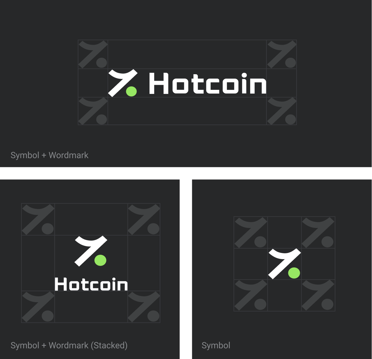
To ensure optimal visibility and brand impact, the Hotcoin logo must always be surrounded by a clear space free of any text, graphics, or other visual elements. This protective margin prevents visual clutter and maintains the logo’s prominence across different applications. The minimum clear space is defined by the height of the logo symbol, ensuring a balanced and unobstructed presentation in any layout.

Clear Space

Multi-Color Combinations

The Hotcoin logo also allows for select multi-colored variations that build upon our approved monochromatic arrangements. In these versions, the logo symbol follows one of the three permitted color schemes—green, red, or black—while the wordmark is rendered in either black or white, depending on the background for optimal contrast. This approach ensures that the multi-colored logo remains visually cohesive and maintains strong readability across different applications.

Multi-Color Combinations

Partnerships

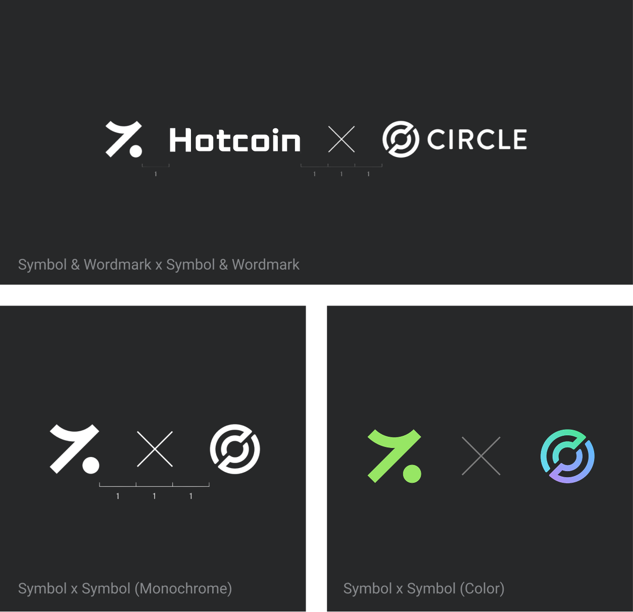
In brand partnerships and collaborations, it’s important to maintain proper spacing between logos to ensure a balanced visual hierarchy. Both the Hotcoin logo and the partner’s logo should be treated equally, with sufficient clear space around each to maintain their visibility and impact. Careful alignment helps create a cohesive and professional presentation.

Partnerships

Primary Brand Colors

Hotcoin has four distinct brand colors: Meadow, Coral, Midnight Moss, and Dark Canyon. These colors can be used interchangeably within the conventions outlined in the guidelines, offering flexibility while ensuring visual consistency across all brand materials. Each color has a unique role within the brand identity, from accentuating key elements to creating a sense of balance. It’s important to follow the specified guidelines for each color’s application to maintain a cohesive and professional look in all communications.

Primary Brand Colors

Brand Color

The Hotcoin color palette includes a range of 10 distinct shades that smoothly transition between the brand’s greens and reds. These gradients allow for dynamic color variations that can be used across product and marketing touchpoints, providing depth and versatility to the brand’s visual identity. Each shade is designed to seamlessly fade into the next, ensuring a harmonious look across various applications.

Brand Color

Gradients

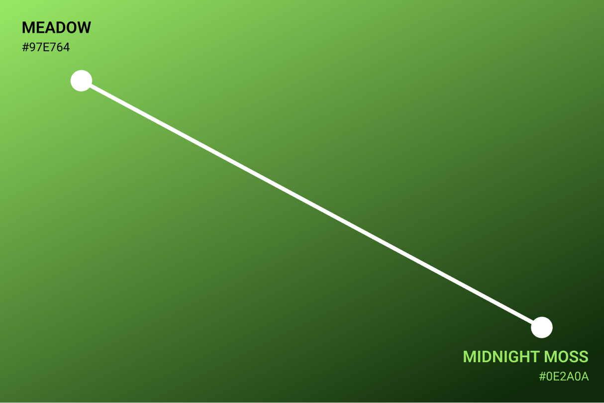
The Hotcoin greens and reds can be arranged in gradients that flow seamlessly into one another, adding depth and visual interest to the brand. These smooth transitions create a dynamic, modern aesthetic, ideal for use in various applications where a subtle color shift is desired. Gradients work well in backgrounds, banners, and design elements, offering a vibrant yet cohesive look. Be sure to apply these gradients thoughtfully to align with the brand’s identity and maintain consistency across all touchpoints.

Gradients

Use Cases

Illustrations are most effective when used to simplify and break down complex services within Hotcoin’s product repertoire. Given the technical nature of crypto and finance, visuals can help translate intricate concepts into digestible, engaging narratives. They play a key role in making abstract ideas more accessible, whether it’s explaining a new trading feature, visualizing the benefits of staking, or guiding users through security processes.

Use Cases

Brand in Use

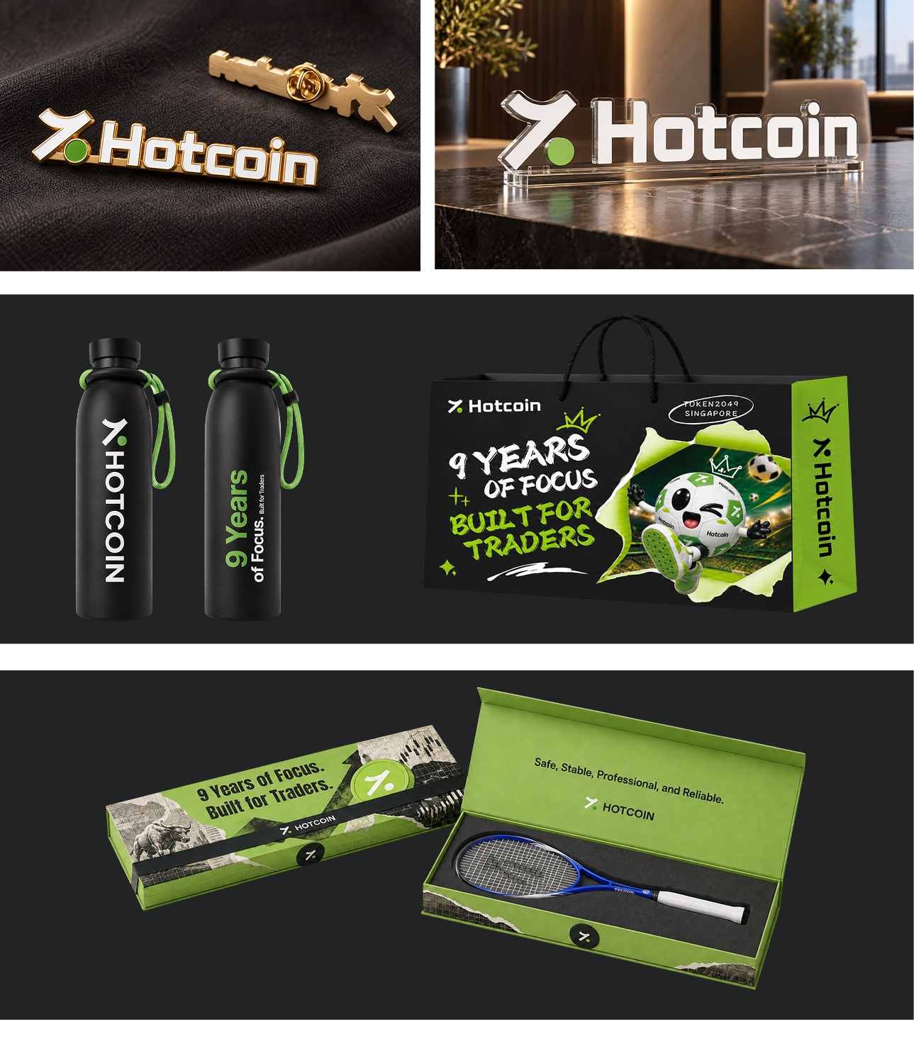
The examples in this section showcase the correct use of Hotcoin brand assets, including the logo, color palette, and typography. These visuals demonstrate how to maintain consistency while creatively applying the brand’s visual elements across various materials and formats.

Brand in Use