
How to Read a Candlestick Chart: A Beginner's First Lesson
Candlestick charts, also known as K-line charts, are among the most fundamental and important price visualization tools in cryptocurrency trading. Each candle uses just four data points—open, close, high, and low—to record the full price struggle within a specific period. For beginners, the key is to understand the structure of an individual candle and recognize that where a common pattern appears matters more than the pattern alone. Because crypto markets trade around the clock, candlestick charts are your first line of defense for reading market sentiment and timing entries and exits.
What Is a Candlestick Chart? From Japan's Rice Markets to Crypto
Candlestick charts, also called Japanese candlesticks, originated in the rice markets of Japan during the Tokugawa era in the 18th century. Rice merchant Munehisa Homma used this method to record price movements and systematized his observations into the Sakata method, one of the earliest candlestick analysis systems. In 1990, Steve Nison introduced this Eastern form of technical analysis to Western finance through his book Japanese Candlestick Charting Techniques, after which candlestick charts spread across global financial markets.
Candlestick charts are widely used in cryptocurrency because a single compact “candle” contains four essential prices: an asset's open, close, high, and low during a specified period, collectively abbreviated as OHLC. Whether you view daily, hourly, or minute charts, every candle depicts the contest between buyers and sellers during that interval.
Breaking Down One Candle: Body and Wicks
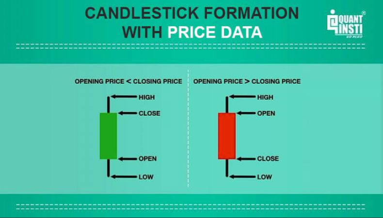
Every candlestick consists of two main parts:
Body: The rectangular area between the opening and closing prices. If the close is above the open, it is a bullish candle, usually shown in green, indicating that buyers dominated and the price rose over the period. If the close is below the open, it is a bearish candle, usually shown in red, indicating that sellers dominated and the price fell. The longer the body, the stronger one side's offensive and the greater the market's conviction.
Wicks: The thin lines extending above and below the body, also known as shadows or tails. The upper wick runs from the top of the body to the high, while the lower wick runs from the bottom of the body to the low. A long upper wick shows that buyers pushed the price higher but met strong selling pressure. A long lower wick shows that sellers drove the price down before buyers absorbed the pressure and pulled it back. The longer a wick is, the stronger the resistance or support in that direction may be.
Here is a quick reference for key single-candle forms:
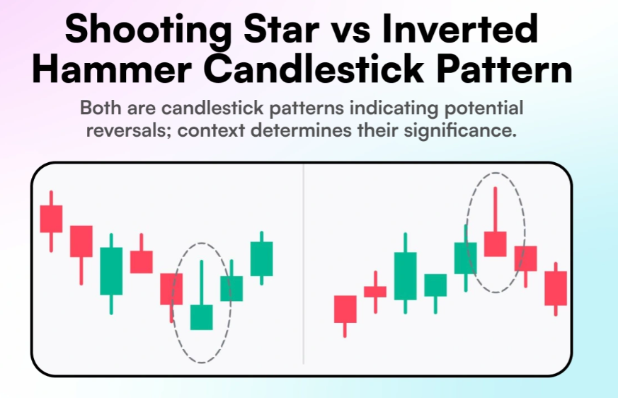
Long bullish candle: A long body with short upper and lower wicks, signaling strong buying power and robust upward momentum.
Long bearish candle: A long body with short upper and lower wicks, signaling full seller control and powerful downward momentum.
Doji: The open and close are almost equal, leaving a very small body or none at all. It reflects market indecision and a temporary balance between buyers and sellers. A doji near the end of a trend can foreshadow a change in direction.
Reading Trends: Sequences of Multiple Candles
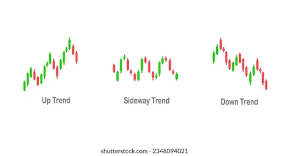
One candle tells you what happened during a single period, but a sequence of candles reveals the trend. This is the essential next step in candlestick analysis: widening your view from one candle to a series of candles.
Uptrend: The chart forms higher highs and higher lows. Bullish candles outnumber bearish ones, and bullish bodies are generally longer. Occasional bearish pullbacks do not break the broader upward structure.
Downtrend: The chart forms lower highs and lower lows. Bearish candles outnumber bullish ones, and bearish bodies are generally longer. Bullish rebounds tend to be brief and fail to reach new highs.
Consolidation (sideways market): Price fluctuates within a defined range, with candle bodies and wicks overlapping and no clear trend direction. Consolidation often serves as a buildup before a major move.
In crypto markets, professional traders commonly start with higher time frames, such as daily and weekly charts, to determine the broad direction, then use lower time frames, such as hourly and minute charts, to identify entries. Do not begin by staring at a five-minute chart—the noise can easily pull you into false signals.
Three Common Beginner Mistakes
Mistake 1: Reading one candle in isolation. A candle's signal must be interpreted within the surrounding trend. The same hammer may suggest a reversal at the end of a downtrend but represent only a routine pullback during an uptrend.
Mistake 2: Assuming candlestick patterns are 100% accurate. Even textbook patterns can fail completely. Crypto markets are highly volatile, and breaking news can invalidate any technical signal instantly. Candles represent probabilities, not certainty.
Mistake 3: Memorizing pattern names mechanically. Instead of memorizing dozens of candlestick combinations, understand the balance of power between buyers and sellers behind each pattern. Location matters more than shape, and context matters more than the name.
Frequently Asked Questions (FAQ)
Q1: Is a bullish candle always red or green?
Colors are merely platform conventions, so do not let them dictate your interpretation. Mainland Chinese stock markets traditionally use red for bullish candles and green for bearish ones. International platforms, including most crypto exchanges, usually use green for bullish candles and red for bearish ones. What matters is not the color but whether the close is above or below the open.
Q2: Are candlestick charts suitable for short-term trading or long-term investing?
They work for both. Short-term traders often use one-minute, five-minute, and one-hour candles to capture brief price moves, while long-term investors look at daily, weekly, or even monthly charts to assess the larger trend. Your time frame should reflect your trading style and holding period. Beginners should start with daily charts before gradually exploring shorter intervals.
Q3: What does a very long wick mean?
A long upper wick indicates that the price rose sharply but then retreated, revealing strong selling pressure above. A long lower wick indicates that the price fell sharply before recovering, revealing strong buying support below. The longer the wick, the stronger the potential resistance or support in that direction, which may be useful when assessing subsequent price action.
Q4: How many candles should I use to identify a trend?
Observe at least 20–30 consecutive candles to form a reasonably reliable view of the trend. With fewer candles, the apparent trend may be short-term noise. Because crypto markets are volatile, consider both one-hour and four-hour charts for the short-term direction and use the daily chart to confirm the larger trend.
Q5: What is the difference between a candlestick chart and a line chart?
A line chart connects closing prices only. It is simple but omits substantial information, including the open, high, and low. A candlestick chart presents all four key prices, allowing you to see the complete picture of openings, closings, highs, and lows. For serious traders, candlestick charts provide much greater information density than line charts.
Related tutorials:
Introduction to Crypto Technical Analysis: From Candlesticks to a Trading System
RSI Explained: A Practical Guide to Overbought and Oversold Conditions
Classic Chart Patterns: Head and Shoulders, Double Tops, Triangles, and More
Recommended reading:
Lettura consigliata
Visualizza altro

Service@hotcoin.com
Product@hotcoin.com
Business@hotcoin.com
Casecn@hotcoin.com